Overview
Over four years at OutSystems — joining as a contributor and growing into a lead role — I shaped the Figma and designer experience side of a complete design system rebuild for a community of 9,000+ designers and developers across Banking, Insurance, Retail, and Logistics. The work wasn't component production — it was building the infrastructure that made thousands of people's daily work faster and more consistent. The design-dev collaboration model behind it was later presented at Figma Layers 2025.
The business context
OutSystems is a low-code development platform with a large, active community of designers and developers building enterprise applications on top of it. With thousands of teams shipping products across industries — Banking, Insurance, Retail, Logistics — consistency and speed weren't just nice to have. They were the platform's core value proposition.
The design system those teams were building on had never been properly owned. It had accumulated over time — components designed in isolation, inconsistent naming, no accessibility baseline, no native mobile foundation. What existed was a starting point that had grown beyond its original scope without ever being redesigned for it.
The consequences spread across the community. Designers detached components and modified them rather than using them as intended. Developers rebuilt from scratch when existing components didn't meet their needs. Inconsistency compounded across thousands of projects. The system was generating more work than it saved.
Research and discovery
Before designing anything, I ran a full research programme to understand how the community actually used the system and where the real gaps were.
Six research methods informed the rebuild: moderated and unmoderated interviews with designers and developers on design system usage and design-to-code translation; competitive analysis of 10 market-leading apps across 8 industries using an internal scoring framework; component usage data analysis to identify the least-used elements and most common workarounds; UX audits of existing components for consistency, quality, and accessibility; community feedback collected through forums, reviews, and in-app submissions; and usability testing to measure how the existing system performed against current market expectations.
The research surfaced four core problems:
Limited and inconsistent components.
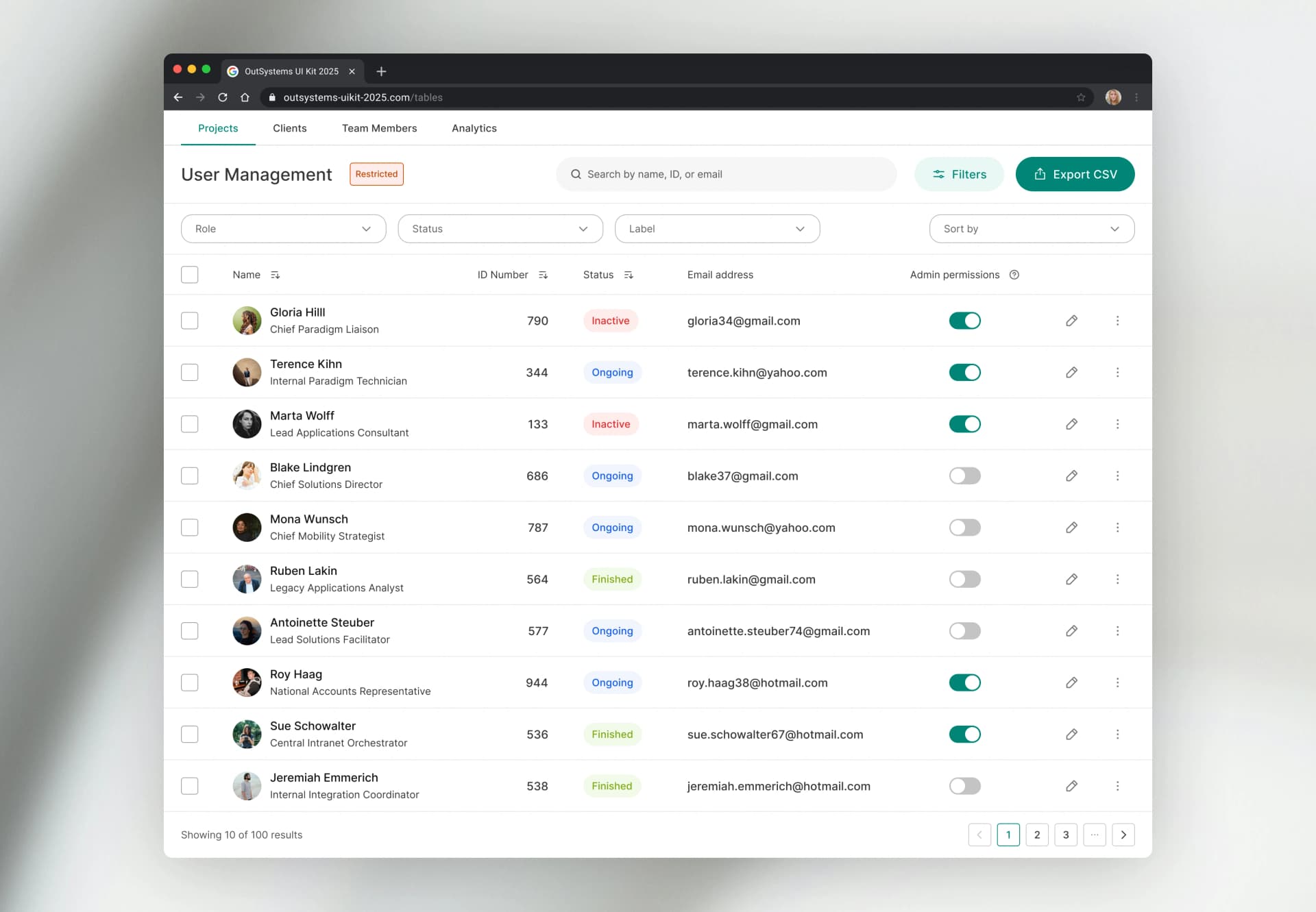
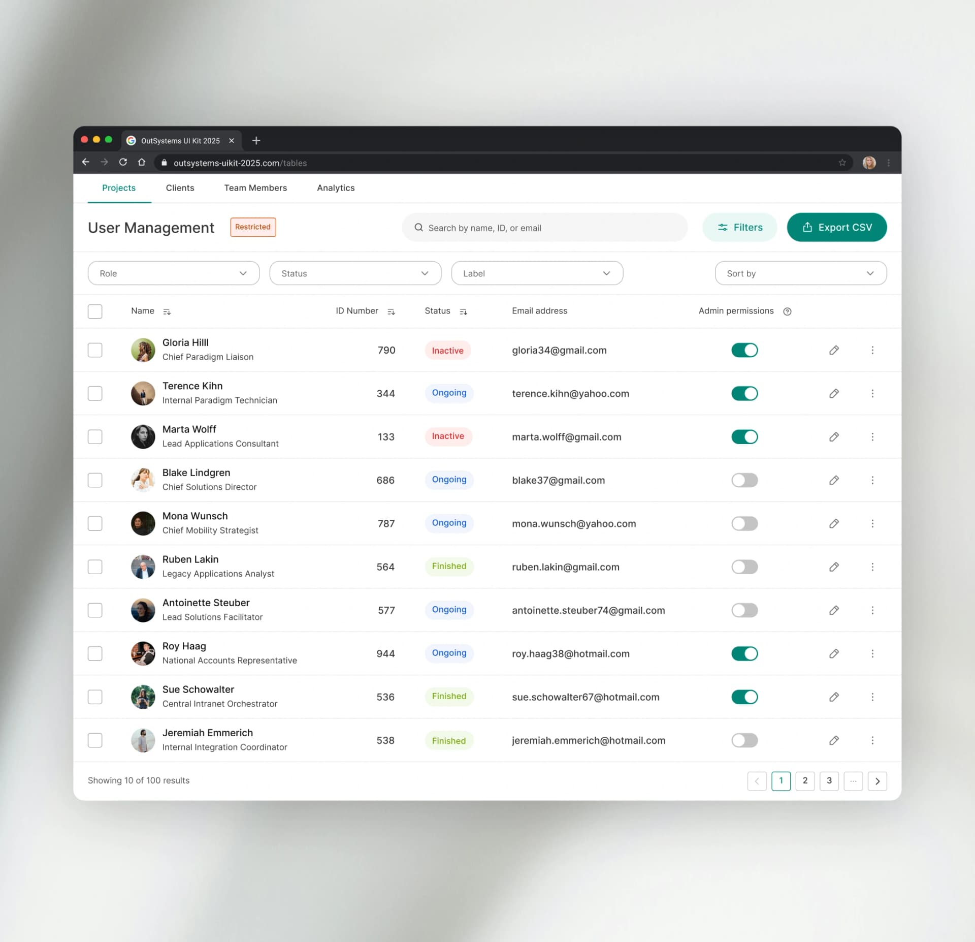
The library covered the basics but not the range the community actually needed. What existed had been built without a coherent variant system — designers were spending significant time modifying components or building their own, then detaching them from the system entirely. Every detachment was a point of future inconsistency.
A design experience that hadn't kept pace with the market.
The system lacked the guidelines, interaction patterns, and design features that had become standard in modern product tooling. Teams building on OutSystems were producing experiences that lagged behind mobile and web standards — not because of platform limitations, but because the design resources hadn't evolved.
No native mobile foundation.
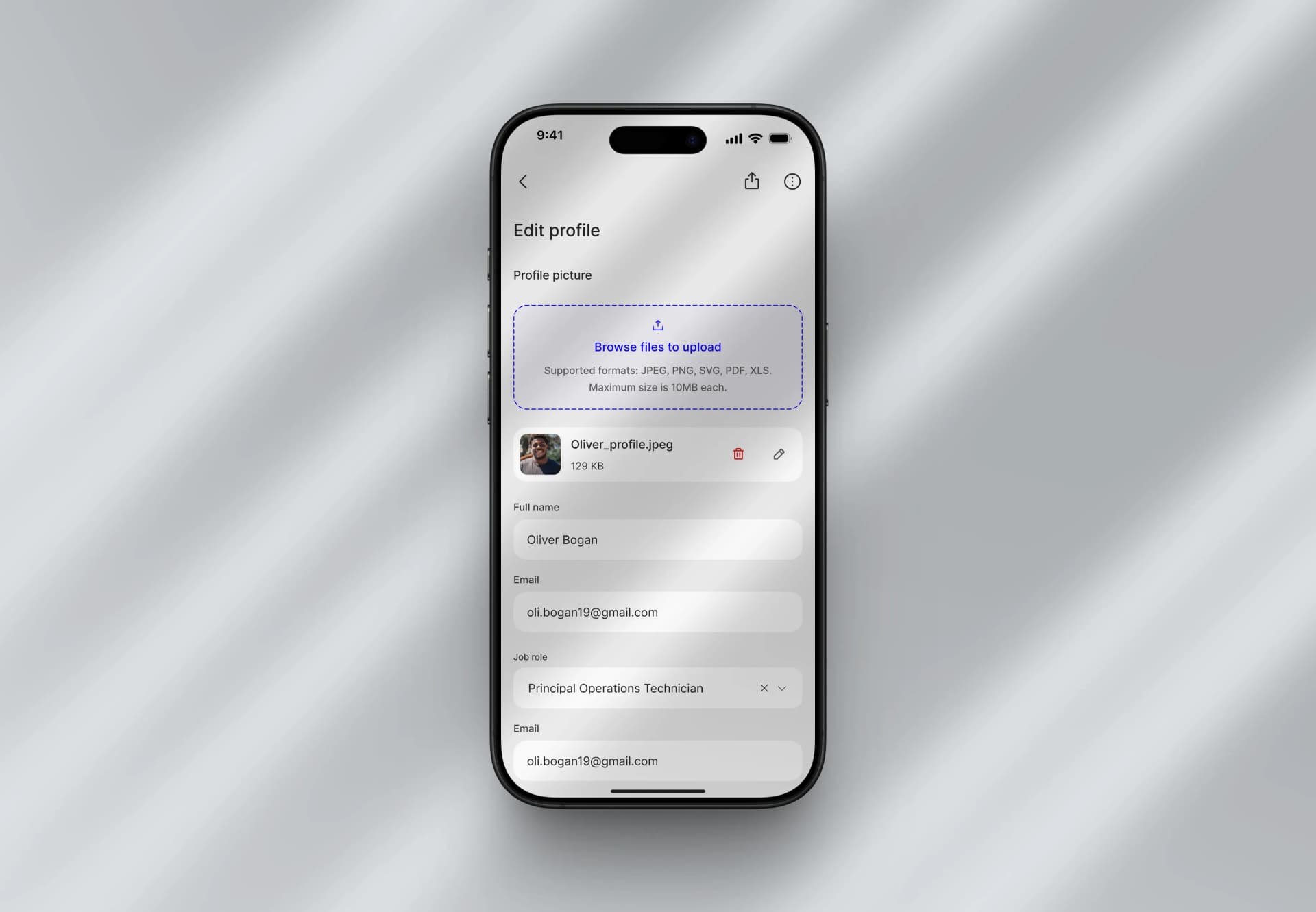
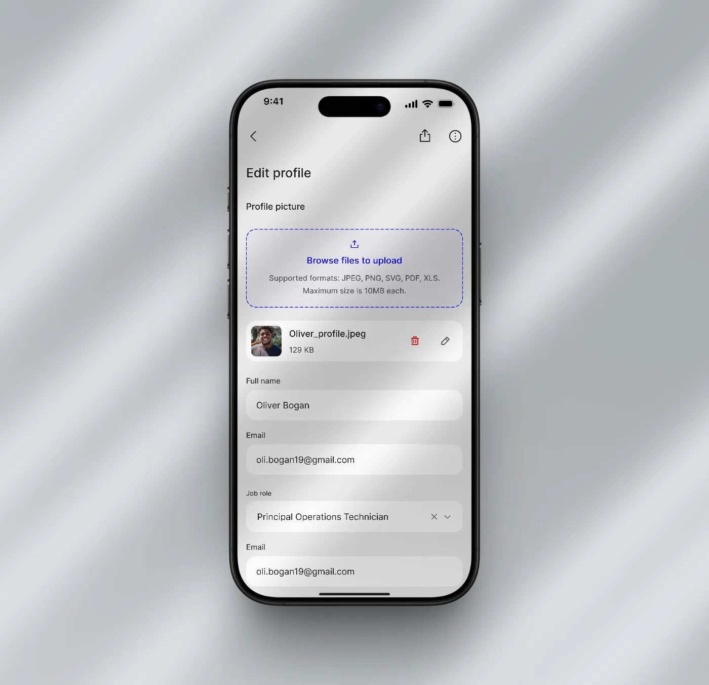
Mobile experiences had no native gesture support, no up-to-date interaction patterns, and no smooth transitions or micro-animations. Teams were producing web-first experiences by default, regardless of the deployment target.
Accessibility below standard.
Colour contrast, dynamic font support, and minimum touch target areas were all below WCAG requirements. Accessibility had been treated as an edge case — which meant every component built on the system inherited those gaps.
Key decisions
Architecture before components.
Before any component was designed, the work began with a full audit — what existed, what was missing, and what the system needed to support at each level, from foundations through complex patterns. Every structural decision made here determined what was possible later. Starting with components would have optimised for the wrong thing.
Design for 9,000 different contexts, not one team.
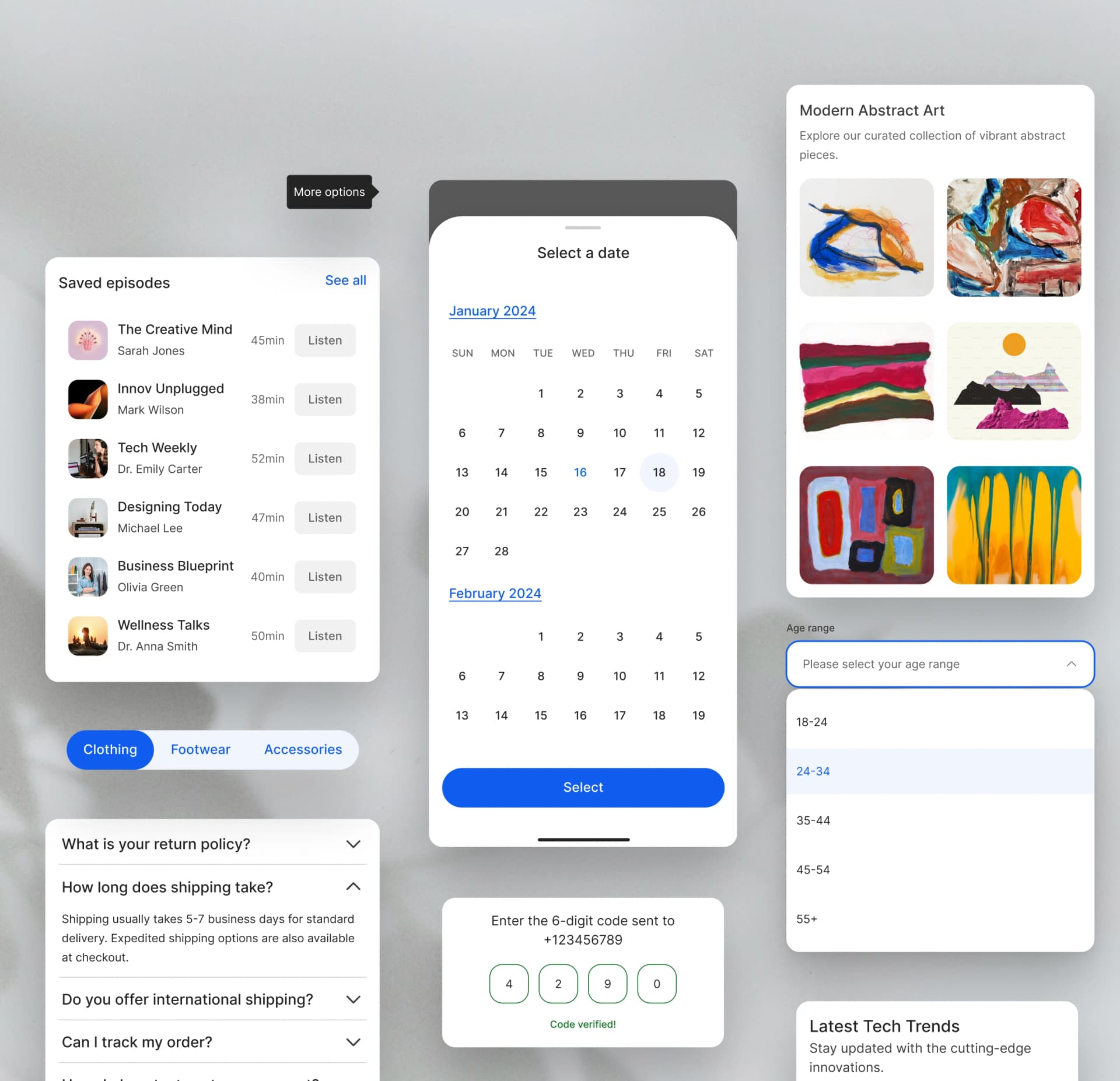
A component designed for a single team can make assumptions — about the product, the brand, the use case. A component used by 9,000 people across Banking, Insurance, Retail, and Logistics can make none. Naming conventions, variant structures, edge case handling, customisation depth — every decision had to work across the full range of community contexts, not just the most common one. Scale-awareness wasn't a constraint added at the end; it was a design requirement from the start.

Accessibility as a foundation.
Rather than auditing for accessibility after the fact, the baseline was established first: WCAG-compliant colour contrast across the full palette, a minimum 40px touch target on every interactive element, dynamic font support, screen reader compatibility, and RTL layout support. Building it into the foundations meant every component inherited it by default rather than having it addressed component by component.
Slots over variants.
The default solution to component flexibility is variants — pre-building every possible combination. We took a different approach: slots. Every component where a designer might need custom content — modals, cards, bottom sheets — was built with intentional placeholder areas that could be made visible or hidden and swapped for any instance, without touching the component itself. One modal could contain anything. One card could handle dozens of use cases. Designers got the flexibility they needed without ever detaching from the library.
This was built before Figma introduced native slots as a feature — a solution designed from first principles to solve the closed-component problem before the tool caught up.
The slot architecture was also designed with the developer side in mind. My focus was the Figma and designer experience; the developer experience team mapped the same concept into OutSystems Studio — the platform where the framework lived in code. The result was the same mental model on both sides: same slots, same property names, same component structure in Figma and in Studio. Designers could hand off with confidence. Developers could implement without guessing.
Developer handoff as a design constraint.
The 40% reduction in development time didn't come from clever components alone — it came from treating the handoff specification as part of the design work itself. Documentation, behaviour specs, and edge case definitions were produced alongside the components, not after them. A component that is visually correct but ambiguous to implement doesn't save time — it creates it.
What was delivered
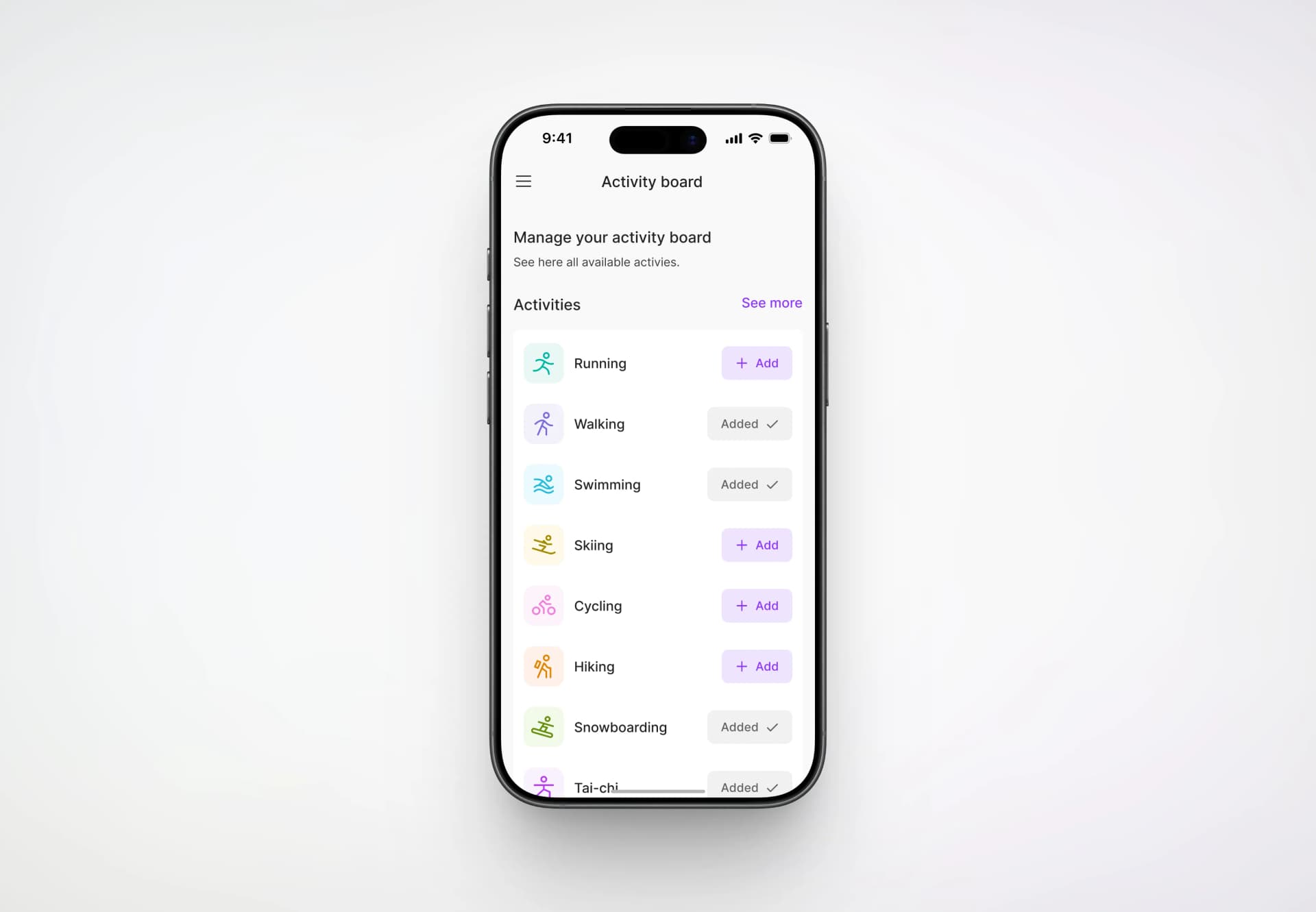
A fully rebuilt design system covering foundations, a 40-component library, documentation, and a governance model for long-term community contribution — with the Figma kit designed to map directly to the Studio implementation the developer experience team built in parallel.
Foundations — A complete typographic system with distinct type scales for web and native platforms, a colour palette expanded to 15 colours with 12 WCAG-compliant shades each, a 4px grid with standardised spacing and layout rules, and a two-layer shadow system covering elevation hierarchy across flat and neumorphic design approaches. All values tokenised — colour, motion, spacing, borders, typography — stored in a GitHub repository via Token Studio, so developers could pull the most recent design values directly into their codebase.
Component library — 40 newly designed components powering 60 variants in total, built around the slots architecture. Each component shipped with built-in accessibility, defined states and sizes, and native mobile behaviours including gestures, transitions, and animations. Every component went through a moderated design critique with a focus group of 3–7 community designers before release.
Documentation — Usage guidelines written for the questions the community actually asked: anatomy, variations, accessibility considerations, best practices, and the common mistakes surfaced during critiques. Not a comprehensive spec — a practical guide to building on the system correctly.
Governance — A contribution model that let the community extend the system without fragmenting it, and a long-term maintenance approach that kept the system aligned with platform updates and evolving market standards over four years.
The 70% reduction in component detachments across the community was the clearest signal the system was working — designers were building on the framework rather than around it.