Overview
Co-leading with one other product designer, we were brought in to fix a research recruitment process that had never been properly designed. In two months, we mapped the end-to-end workflow, identified where the real time cost sat, and delivered a unified platform covering the full recruitment cycle. The time returned per study wasn't found in any single feature — it came from treating the whole workflow as a design problem, not just the intake form.
The business context
User research was central to how this company built products. With a large internal design and product organisation, research requests were constant — product managers, designers, and researchers across multiple teams all needed participants for interviews, usability tests, and surveys on an ongoing basis.
The process for recruiting those participants had never been properly designed. It had grown organically — a spreadsheet here, a Slack message there, a form in one tool and a tracker in another — until it had become an 8-application, 169-task process that took over 8 hours per research cycle to complete.
The overhead wasn't just time. It was creating errors, losing participants, and making it harder for researchers to run studies at the pace the product organisation needed. Research Ops were coordinating blindly across a system that had no single point of truth — and every study put that fragility back on the table.
Research and discovery
We mapped the existing process end-to-end — every tool, every task, every handoff. 169 steps across 8 applications to complete a single recruitment cycle.
The research surfaced three core problems:
Fragmentation killed momentum.
The 8-tool process wasn't just slow — it was fragile. Every handoff between tools was a potential failure point: participants fell through gaps between systems, confirmation statuses lived in different places depending on who had last updated them, and researchers regularly had to restart coordination from scratch when a handoff went missing. The process produced unreliable outcomes not because people weren't careful, but because the system required too much care to work correctly.
Manual overhead dominated the workflow.
Most of the 8+ hours weren't spent on work that required human judgement. They were spent on data entry, copy-pasting participant information between tools, sending follow-up messages that could have been automated, and manually tracking confirmations that had no single home. The cognitive overhead of maintaining awareness across 8 applications compounded this — researchers weren't just doing manual work, they were also managing the mental load of keeping track of where everything was.
Research Ops had no unified view.
With requests coming in from product managers, designers, and researchers across multiple teams, Research Ops was responsible for prioritising and coordinating all active studies simultaneously. But there was no single view of the full pipeline — every status check required manually aggregating information across tools. Prioritisation decisions were guesses. Capacity planning was impossible.
Key decisions
Design the full workflow, not a better form.
The initial brief pointed at the intake experience as the problem. But mapping the full 169-step process revealed that intake was only one failure point among many — and that fixing it in isolation would have recovered at most an hour, not seven. The decision to scope the project to the end-to-end recruitment workflow, including the Research Ops management layer, meant the design addressed where the time actually went rather than where the problem was most visible.
Design for Research Ops, not just the requester.
Most tools in this category are built for the person submitting a request. The submission experience matters — but the 169-step overhead didn't sit there. It sat with Research Ops, who had to manually coordinate across all eight tools for every study. Building a proper management view — status tracking, pipeline visibility, bulk actions — rather than just improving the intake form is where the majority of the time saving came from. A tool designed only for requesters would have produced a fraction of the outcome.
Make status structural, not decorative.
Status wasn't treated as a label added to a record. Every participant, every request, and every action in the system had a defined state that drove what appeared in the list view and what actions were available at any point in the workflow. Researchers could see where everything stood at a glance — no clicking in, no cross-referencing a spreadsheet, no Slack message needed. That decision eliminated the majority of the manual check-ins that had been embedded throughout the original process.
What was delivered
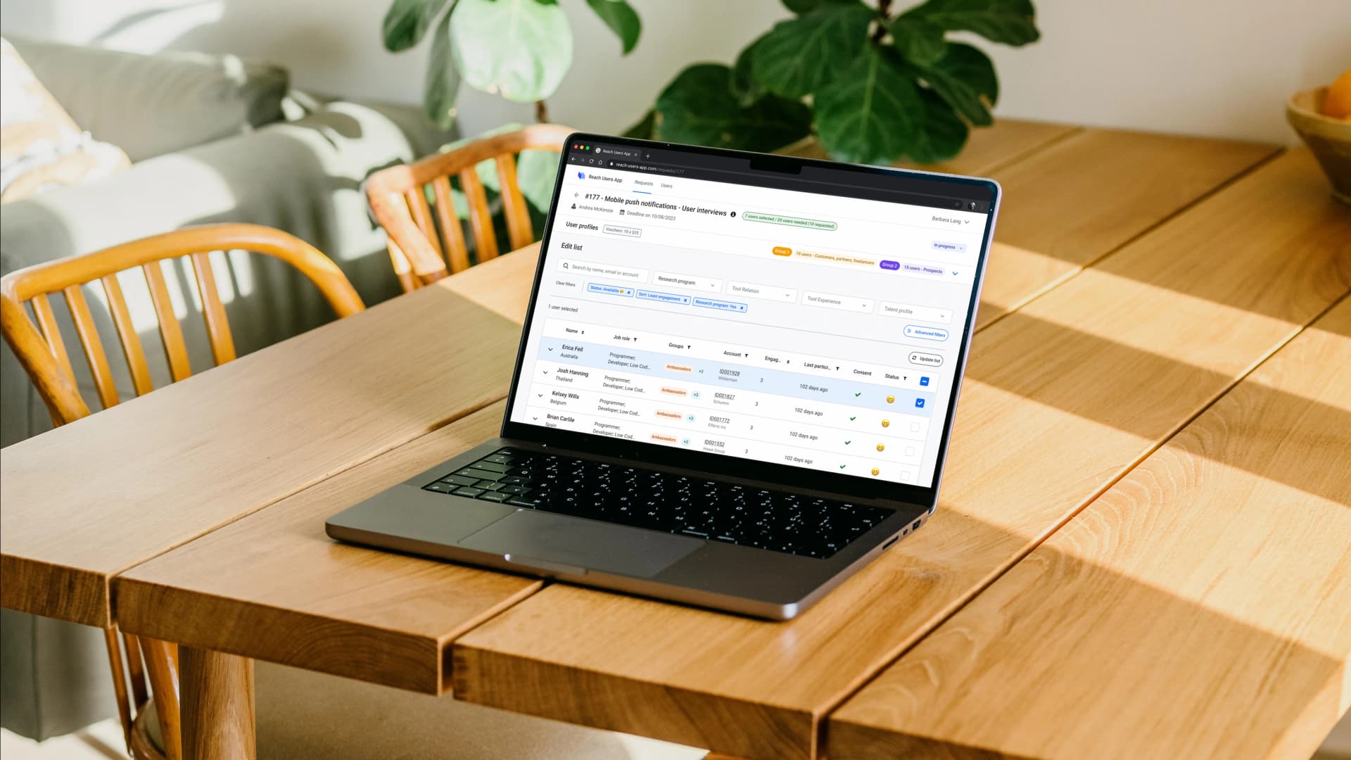
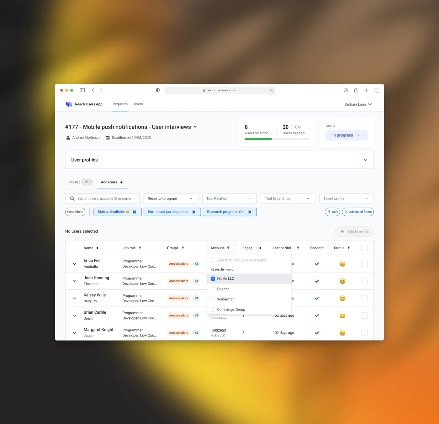
A unified recruitment platform covering the full workflow — from initial request submission through scheduling, confirmation, and Research Ops oversight. Together, the three core areas of the design replaced 8 tools and 169 steps with a coherent, single-surface workflow.
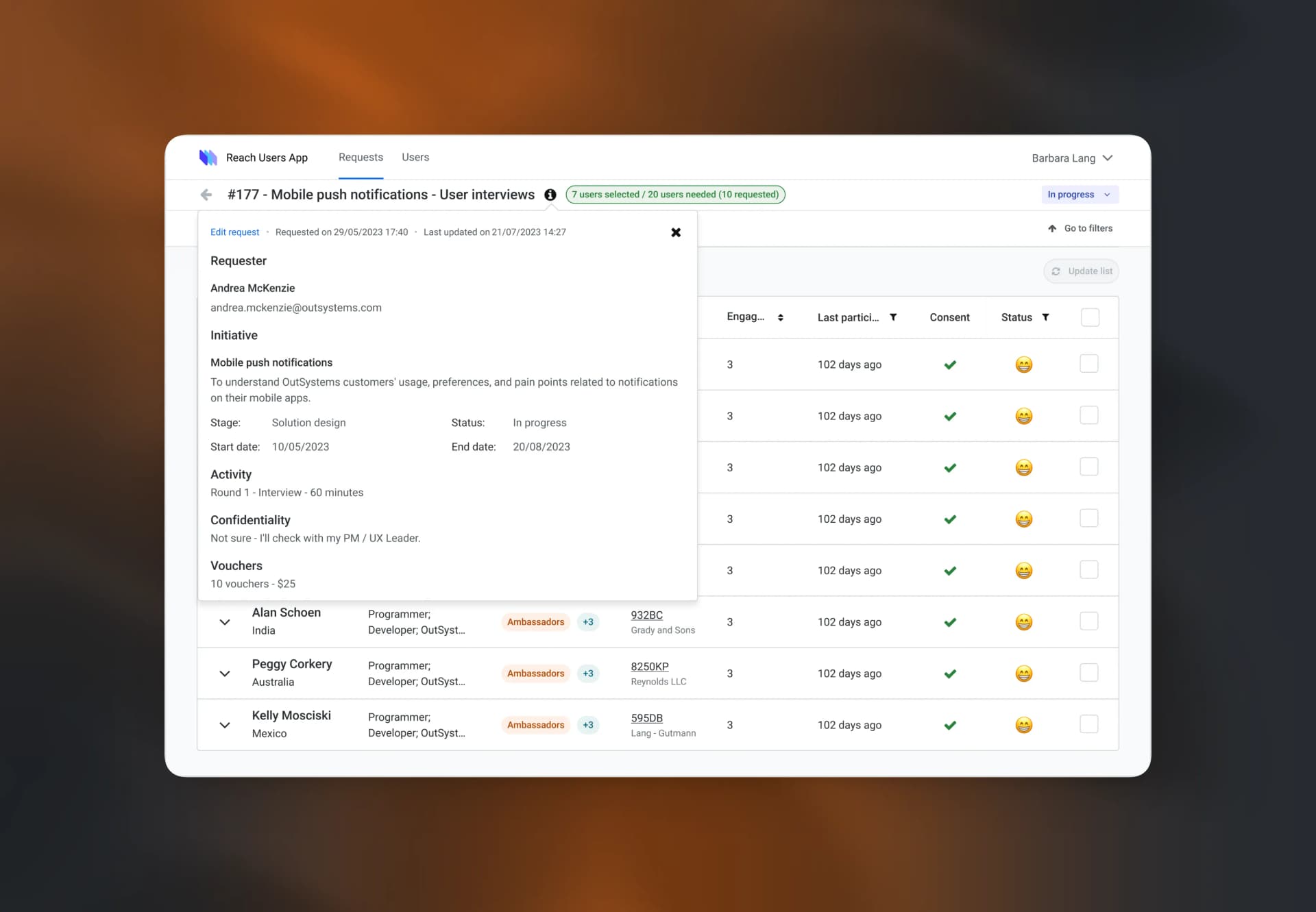
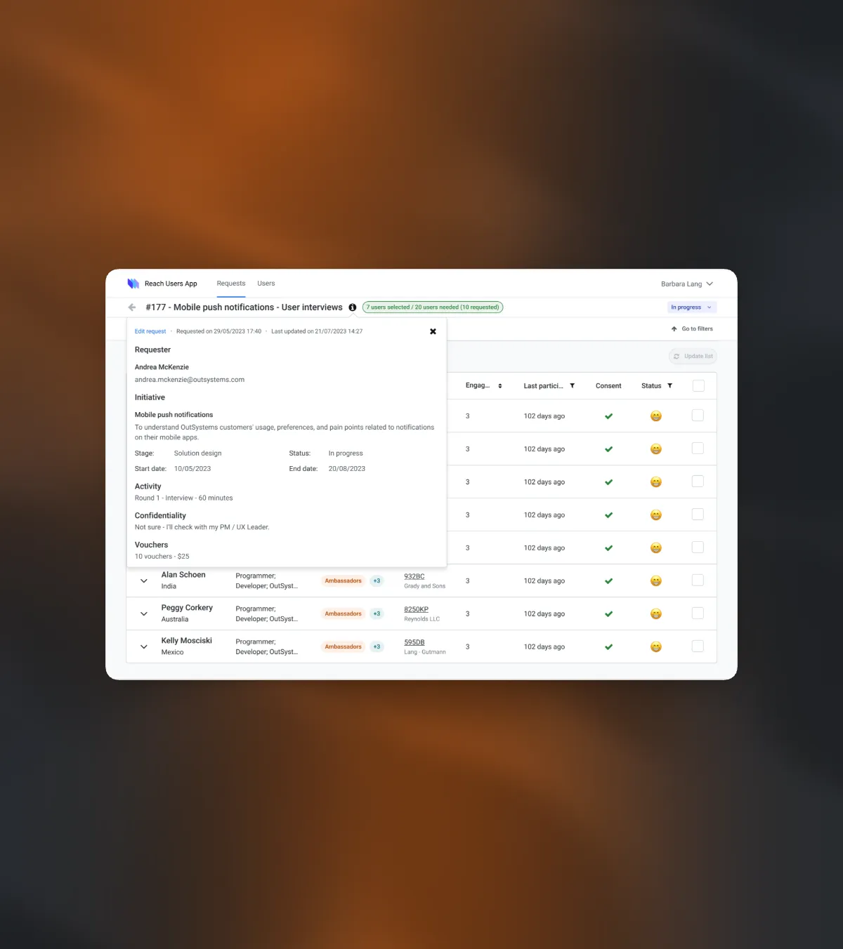
Intake & request flow — The beginning of the workflow, redesigned as a form that passed context forward rather than creating an isolated submission. Instead of requiring Research Ops to chase requesters for missing information after the fact, the intake flow collected everything needed to begin coordination immediately — study type, participant criteria, timeline, and any prior screening context. Requesters had visibility into their submission status from day one.
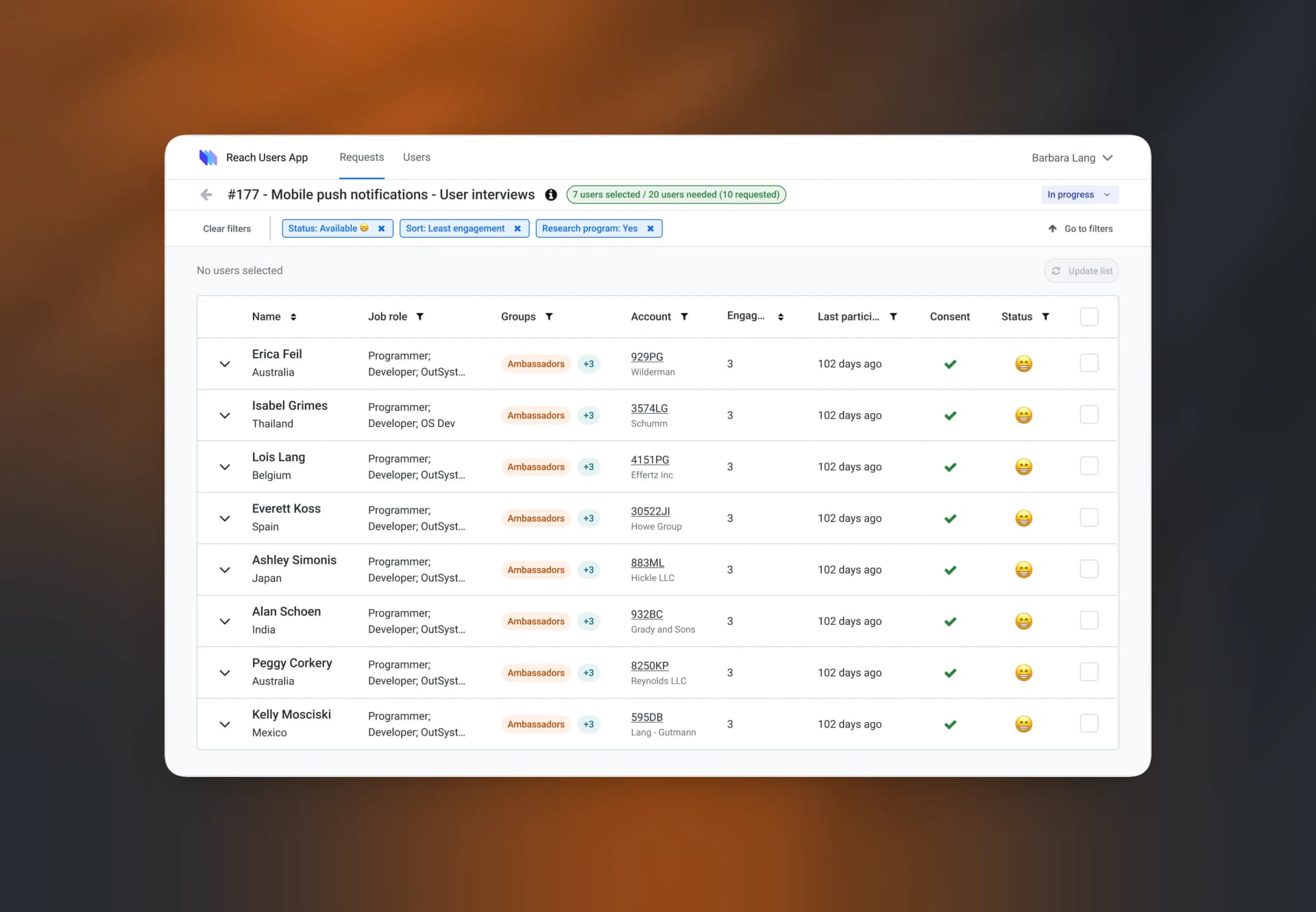
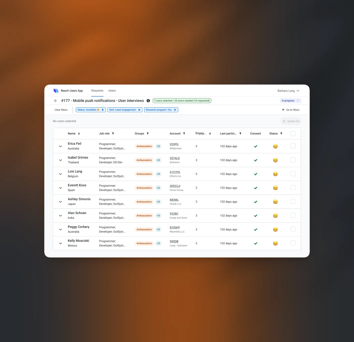
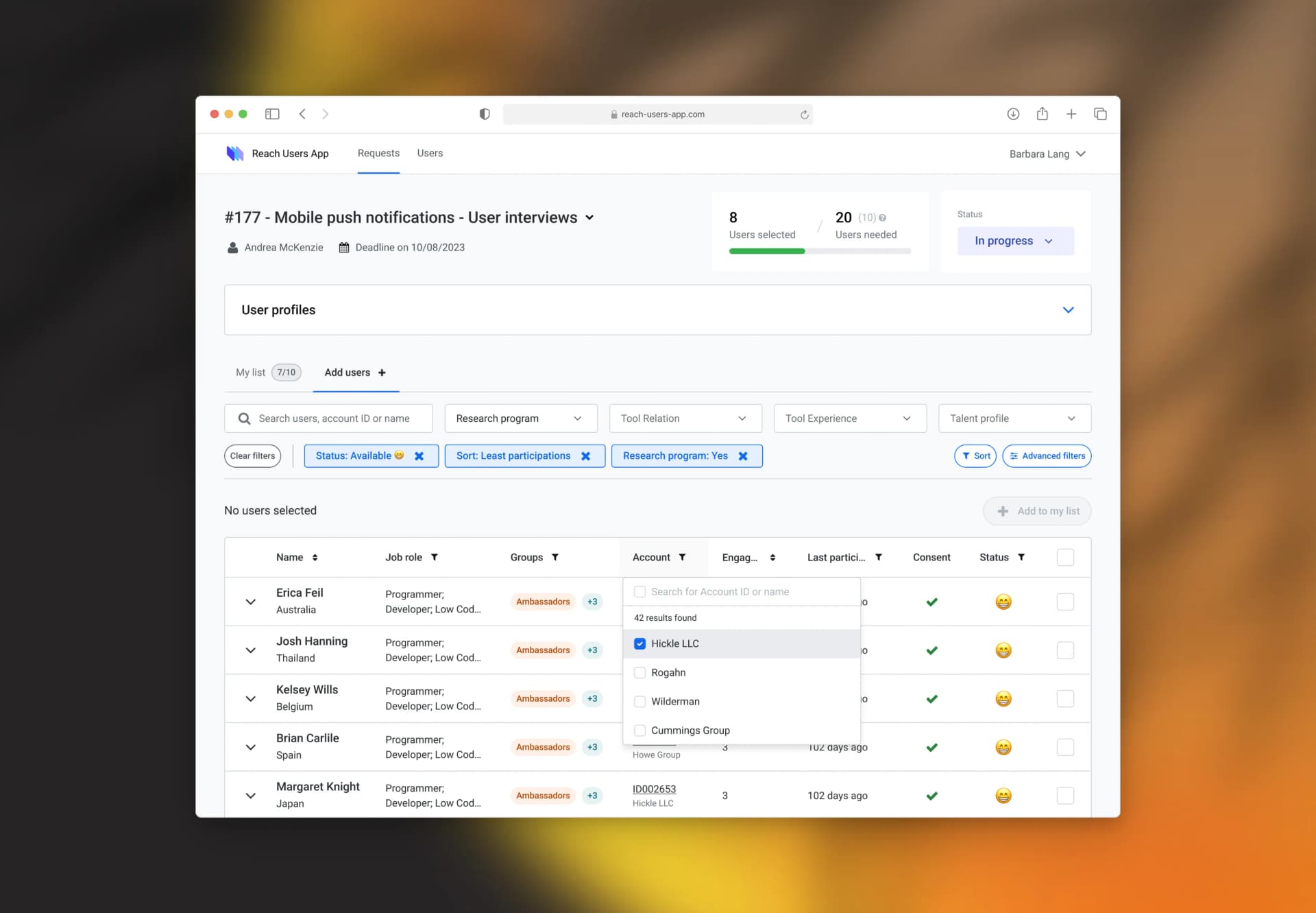
Participant management — The central workspace for Research Ops: a list view in which every participant's status was visible at a glance, bulk actions replaced manual one-by-one operations, and the full communication history was accessible in one place. The most-used filters surfaced above the fold; advanced controls collapsed beneath them. Scheduling and confirmation were managed here — not across separate tools.
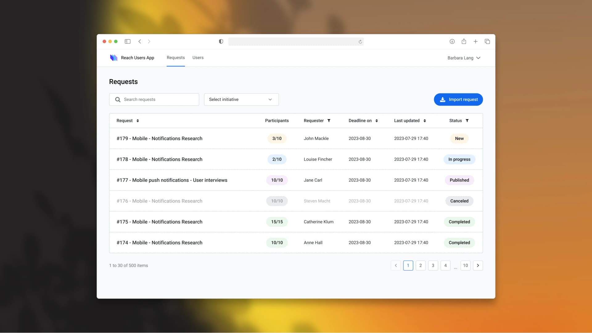
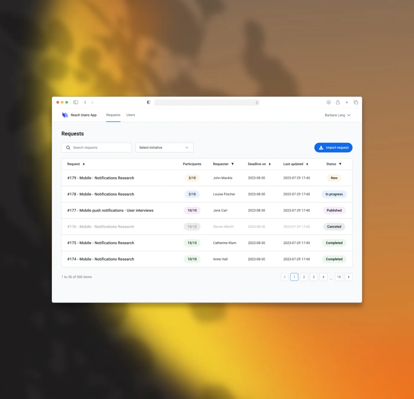
Research Ops oversight — The view that had never existed before. A full pipeline of all active research requests across every team, sortable and prioritised, with status visible without drilling in. Research Ops could make informed priority calls, spot capacity issues in advance, and coordinate across simultaneous studies without manually aggregating across tools. This is where the single largest concentration of time was recovered.